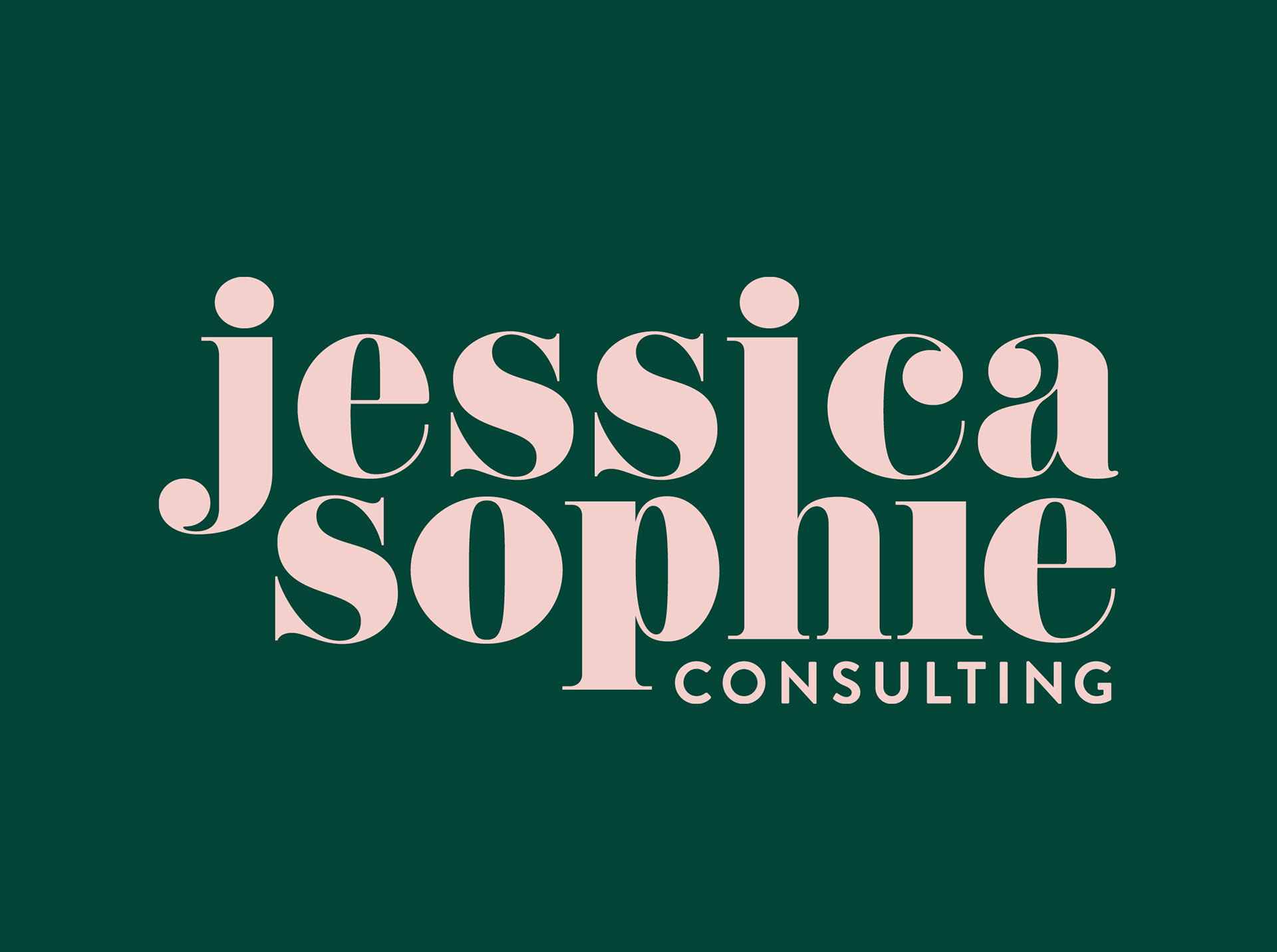
The client wanted a wordmark with personality for a young, modern, female-led marketing company. After initially experimenting with simpler, sans serif uppercase typography, we decided that we needed to inject a bit more life into the brand and this was the result.